
|
Written by Dan Virgillito | @danvirgillito  Since its inception, it's been admired, dissed, hated, loved, critiqued …but never ignored. As decades went by, it remained on the list of first considerations made by a founding team of a new brand. It’s also a critical element for an aging brand that needs a revamp. Designers have had a creative crush on it ever since they first encountered it in their arts and visual class. Its name? Logo. The importance of a great logo cannot be underestimated; it’s a sign of confidence and the most important symbol for customers to identify your business. But here’s something worth your attention: Not every logo gets noticed. The vanishing attention spans of consumers has made it difficult for brands to get attention with basic logo design. As a result, it’s becoming more important for brands to learn and implement logo design best practices. Designing great logos takes a little more time than one would think. There’s no set process for designing one and it comes down to preference in most instances. That said, knowing the best practices to logo design can definitely be enlightening. 1. Choose the Right Color University of Loyola, Maryland, published research that showed color can increase brand recognition by 80 percent. The underlying reason being there is a strong correlation between emotional responses and color, implying that the selected color will determine how your brand is viewed. For instance, luxury brands like Michael Kors and Chanel use silver, gold, black, and white to promote a sophisticated image. Restaurants like Pizza Hut and Burger King utilize red in logo design to simulate hunger. 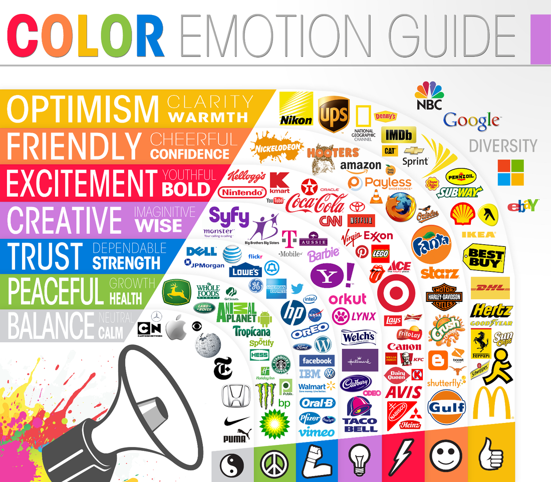 Source When it comes to logo design, let this be a guide for the selection of your color palette. Also, consider your brand’s personality. What virtues does it highlight? Innovation, intuitiveness, speed? Knowing your focus can be significant to refining your color selection. Multiple colors can be used if you want to emphasize audience diversity or product variety. Don’t shy away from experiments. 2. Choose an Ownable Font Type Your logo has to endure design fads (at least for 5-10 years), and your font has to do the same. That’s why it is essential to choose an ownable font – something that your brand’s logo can retain proudly over the years. The font should make it easy for the audience to read the text and communicate your brand’s personality. The infographic below gives an overview of how different types of fonts evoke different emotions: 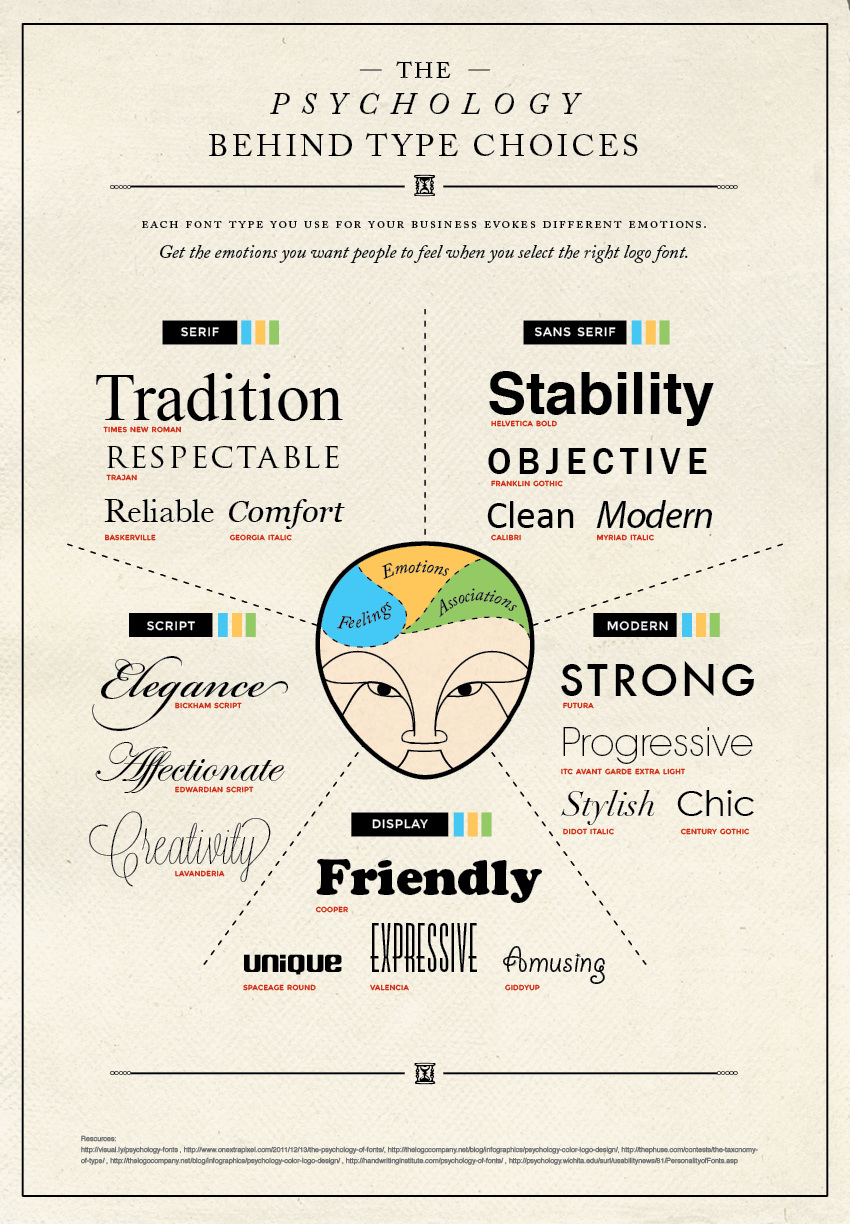 Source Look at HSBC’s logo. They applied uppercase to the classic serif font, depicting a strong identity. It’s also important to select a font that translates well across different media, like HSBC’s does. It should display consistency across printed collateral, web text, and smart devices.  There are more fonts to select for logo design than those offered by Microsoft Word. Websites such as fontsquirrel.com can be used to find a relevant font. If you come across a font that you like online, a tool like WhatTheFont can be used to identify it. 3. Utilize the Strength of Negative Space Negative space is the area in logo design that is not occupied by forms or objects. Brands don’t pay much attention to this area while making logos, or just fill it with casual scribbles. That is a mistake because smart use of negative space makes a logo much more special by giving it deeper meaning. Positive space on the other hand is the subject in the logo. This can be words, an object, or an alien from Star Wars. The area that surrounds the subject of the logo is negative space. Ignorance of this space often results in overwhelming and cluttered logo designs. FedEx’s logo depicts brilliant use of negative space:  The negative space is all the white area around the logo, and if you take a closer look, you’ll also see the negative space between the letters “E” and “x”. That’s a white arrow hidden within the logo. If anything, the use of negative space means you don’t rely on senseless objects just to make your logo design look busy. White is an effective color for adding negative space, but don’t be afraid to experiment with other colors. 4. Aim for Simplicity A simple logo design is the clearest way to present your brand to your target audience. Simplicity helps people to not only actively remember your logo, but also memorize the value behind your brand. Also, simple logos are easy to tweak if required while maintaining the brand’s personality. When in logo design consideration, it is vital to keep things simple. Siegel + Gale conducted a survey of 3,000 respondents in the UK and US to try to get some actual stats on what makes a logo memorable. The outcome revealed that simplicity sticks with people. The most memorable logos belonged to McDonald’s, Coca-Cola, Nike, and Apple. All these brands have fairly simple logos: there’s no extra noise or clutter. Also, even if the participants didn’t know of a pool of brands, simpler logos proved the most memorable.  The survey found that people were 13% more interested in simpler logos than complicated ones, and these logos were 6% more likely to make a brand appear as unique compared to its competitors. What does this mean? If you’re considering logo design, use a combination of simple font, color, object and negative space to create a simple logo. The availability of options like Spaces logo maker means you don’t even have to be a graphic designer. Today, brands can just type their brand name into a logo generator, choose an icon, choose a font, and play around with different options. Therefore, you can create simple logos without having to download a software or go to design school. 5. Tell a Story Almost every other brand has a story behind its logo. If it was a mere pattern of fonts or colors, the audiences won’t be able to understand the message a brand is trying to convey. The goal of most brands with logo design is to incorporate a story that helps people instantly recognize and memorize the brand. That’s what Milton Glaser did with the “I Love New York” logo. In an interview, he stated that when consumers first witness a logo, they should get its meaning (he believes that the act between seeing and understanding is crucial). 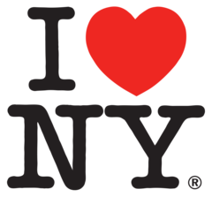 Storytelling will likely always be a crucial part of logo design, especially when the goal is to create a logo that stands the test of time. Remember the logo used for Sydney 2000 Olympics? Here it is again:  The challenge was to avoid quaint Australian clichés when it came to storytelling, namely, the kangaroos and koalas. The individual that designed this logo instead used an image of a running athlete, telling people what the human aspect of the Olympic Games stands for. The athlete is also holding a running torch which trails a line of smoke. A great way to incorporate a story is to think about the emotion you want the logo to communicate and then include details in logo design to support it. Make sure the story effectively conveys your ethics, values and identity. 6. Keep Clutter at Bay Another key to a great logo design is the removal of clutter. It’s quite easy for clutter to sneak into your design and it takes many different forms. On your end, the availability of several design elements (fonts, colors, etc.) makes it easy to incorporate unnecessary details. But do these additions make sense? Is that extra font really needed When you can’t justify the presence of an element in logo design, it’s time to remove it. Keep in mind that the final creation doesn’t have to reflect your brand’s entire functioning. For instance, a fast food brand doesn’t have to show food in its logo (Pizza Hut, KFC, etc.). It’s common to see brands de-clutter their logos over the years. Pepsi, for example, removed the non-essentials from its logo as years went by. 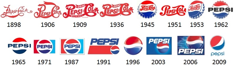 Source They incorporated negative space and even removed “cola” from their logo. These were smart moves to simplify the logo’s outlook and prevent people from getting confused. Clutter can also pop up when you follow design fads. It’s easy to jump the bandwagon of what's trending, and inadvertently, clutter your logo. Keep in mind that you don’t need to include the whole fork, just elements that make your logo forkish, so people pick up the message and digest it easily. 7. Research and Be Original During the process of creating a logo, you’ll come across a ton of designs for inspiration. It’s ok to look at existing works for inspiration and save them to your laptop. You can even highlight the characteristics that make these logos great; use of white space, use of a specific font, etc. It’s also a good idea to research the logos of your competitors. While conducting research, expect to answer the following questions:
Researching the industry or field will also help you get an understanding of the environment the logo is going to be used in. For instance, you don’t want to do a radically different logo design for healthcare companies. Customers in this industry seek a certain level of familiarity and comfort. Logo design varies from field to field, but researching the tons of pre-existing logos will help you determine which conventions are worth incorporating. Final Thoughts Why put in so much thought and effort for a logo? Because it is an emblem of your brand’s purpose and identity. With these best practices, you’ll have a better chance at creating an effective logo design that sticks in the minds of existing customers, attracts the attention of prospects, and encourages brand loyalty. What are your thoughts? Is there a logo design best practice you’d like to share? Feel free to leave comments
|
Categories
All
Archives
March 2018
|
 RSS Feed
